Showing posts with label DC Comics History. Show all posts

Thursday, August 23, 2018

DC Comics Logos 1940 to 2016

I saw this recently on Twitter: an image that depicts the various DC Comics logos used by the company from 1940 up until the current day.


Which was your favorite and/or least favorite?


I have fond memories of the 1949 logo that was still on the first comics I bought during the late 1960s. From 1941 to 1972, DC as a brand was associated with Superman, the most iconic superhero character in the world at that time.


The 1976 bullet logo was a classic, designed by Milton Glaser, used for nearly 30 years. It looked great everywhere, especially on Dollar Comics! I think this is just as good and iconic as the Coca Cola logo. I wonder why any company would abandon it.


Glaser designed many other iconic images, including the "I Love New York" campaign, the Hope poster for Obama, a Bob Dylan poster, etc. This particular image is still iconic and found on merchandise everywhere, from coffee mugs to t-shirts.


The most short lived icon was the 2012 one with the D being a comic book page flipped over, I don't think that was recognizable to the public as an icon alone so they had to put the words "DC Comics" underneath. It was reviled by comics fans. I recall that DC paid a lot of money to have this logo designed, they thought the animation was cool.


The current 2016 logo brings back memories of the 1972 and 1976 logos. It was first used on the DC Universe Rebirth 1 special, as a way to re-brand themselves and bring back fans who were lost during the New 52 years.

Saturday, August 20, 2016

Sorry I Have No DC Comics!

Subscription ad for DC Comics back in 1972...


...notice the exception to the offer - 100 page super spectaculars for subscribers! Must have been painful for that year when Detective Comics was all 100 page super spectaculars editions (with the Manhunter stuff).

The newsstand vendor is completely out of DC Comics because he's been tearing off the covers, sending them back to the distributor for the return value, and selling the coverless remains to someone else for a little profit.

Why is that kid carrying around a pair of scissors? My theory: he's vandalizing the newsstands by cutting out the Marvel Value Stamps directly out of the comics there, leaving his own collection perfectly intact. This kid is a genius, a future Master of the Universe.

Nuff Said!


Friday, June 29, 2012

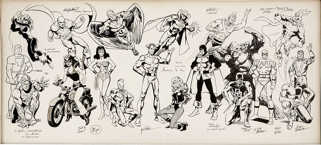
Wrightson, Ditko, Romita, Miller, Beck, Infantino on a Golden-Silver-Bronze Age Jam!

C. C. Beck, Rich Buckler, Steve Ditko, Lee Elias, Carmine Infantino, Fred Kida, Frank Miller, Jim Mooney, Irv Novick, John Romita Sr., Joe Staton, Bernie Wrightson and other artists contributed to this fantastic jam illustration that I found on Heritage Comics.

C. C. Beck, Rich Buckler, Steve Ditko, Lee Elias, Carmine Infantino, Fred Kida, Frank Miller, Jim Mooney, Irv Novick, John Romita Sr., Joe Staton, Bernie Wrightson and Others Original Art (c. 1979-82)

Here is a quick but not complete rundown:

  • Black Cat - Jim Mooney
  • Martian Manhunter - Rich Buckler & Brett Breeding
  • Black Cat (Golden Age version) - Lee Elias 
  • Justice Society (Wonder Woman, Hawkman, Flash, Green Lantern, Black Canary, Dr Midnight - Joe Staton, with an autograph by Gardner Fox
  • Adam Strange - Carmine Infantino
  • Swamp Thing - Berni Wrightson, Len Wein autograph
  • Daredevil - Frank Miller
  • Blue Beetle - Steve Ditko
  • Airboy - Fred Kida
  • Daredevil (Golden Age) - John Romita Sr
This piece must have been owned by Martin Greim, judging from the writing.  A fantastic piece, he was very luck to have all these superstars work on it.  Steve Ditko is a rare one indeed.  Nuff Said!


Tuesday, June 12, 2012

Superman Annual 7 1963 original cover art by Curt Swan

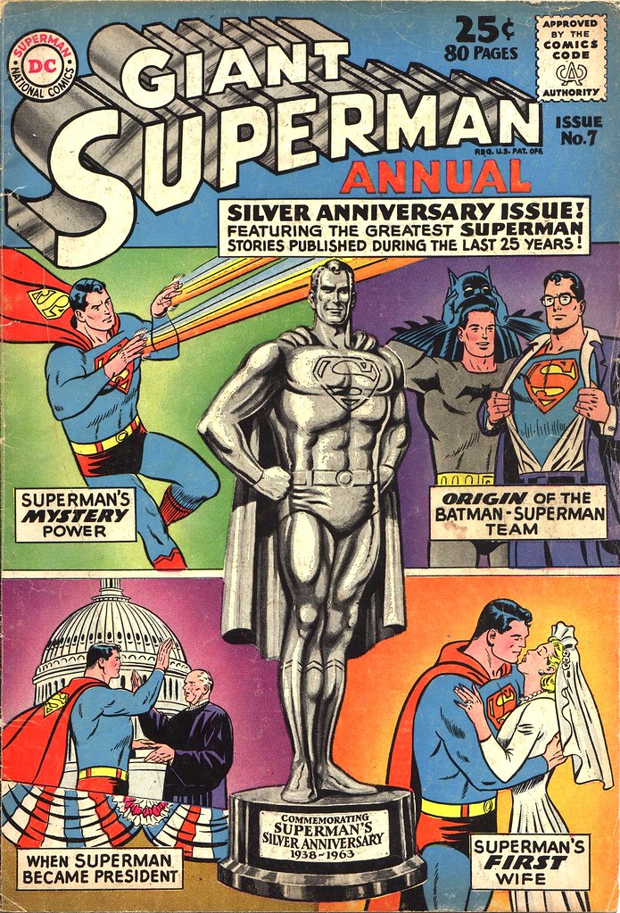
With all the recent changes to Superman, I can't help but look back fondly at the Superman stories from the 1960s and 70s, especially the 80 page giants and annuals that I relished as a kid.  A number of complete stories in one giant comic for a quarter?  These days you get 1/6 of a story that costs more than a Latte at Starbucks!

Superman Annual 7 1963 cover by Curt Swan

This particular Superman Annual from 1963 is in my collection.  I have always found it to be very unusual--the statue of Superman seems to pop off the cover like it was embossed!  A great way to celebrate his silver anniversary.

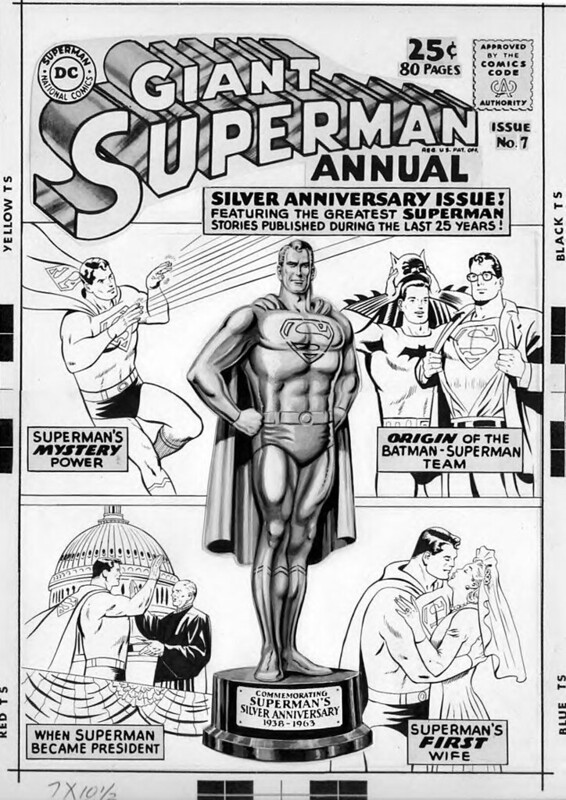
Superman Annual 7 original cover art by Curt Swan

Here is the original art to this annual cover by Curt Swan.  You can see that he really did use gray tones on the statue.  No one was better at representing Superman's character than Swan!  Nuff Said.

Saturday, April 14, 2012

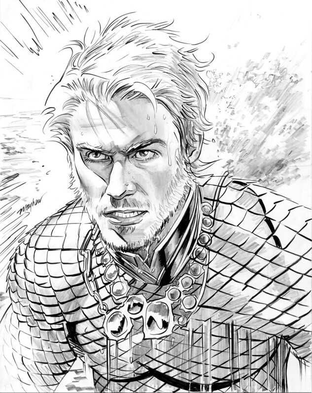
Aquaman by Mike Mayhew plus the mystery of the Paul Norris credit

Aquaman commission by Mike Mayhew

I found this nice commission by Mike Mayhew on DeviantArt, featuring the DCNu version of Aquaman.  I love the rendering here and the splashes of water.

Speaking of Aquaman, I have noticed in the new DC series that the credits page always reads "Created by Paul Norris" in every issue.  Very cool!  I don't recall ever seeing that before.  Norris gets the same credit as Siegel/Schuster or Kane.  Checking out Wikipedia, I saw that Mort Weisinger was listed as a co-creator.  I wondered why the DC credit does not also extend to Weisinger on Facebook, and Eric Nolen-Worthington (TwoMorrows and Modern Masters historian) answered:

Here’s what Paul told me: He went in to the office one day and Weisinger said, “I want a character named Aquaman,” so Paul went home and designed the character from scratch. Weisinger came up with the name, and he did write the first few stories, so technically he was co-creator, but he didn't imbue Aquaman with any personality really—he didn’t even talk with fish originally—and he gave no input on the costume. Paul sued DC for ownership, and part of the settlement they reached was that Paul would get a creator credit.

Interesting!  I googled a bit and found another article on this topic, after Norris died in 2007, on Mark Evanier's site:
...he was at DC Comics where his most memorable assignment was Aquaman, which he and editor-writer Mort Weisinger created. (DC now puts a "created by Paul Norris" credit on all Aquaman comics. The absence of Weisinger's name is apparently a legal problem on DC's end, not a case of Norris squeezing out his former collaborator.)
Some other sites report that DC Comics owed Norris money for each appearance of Aquaman, but only if he was in his classic costume, which led to another lawsuit.  Apparently it was all settled?  Regardless, I could only wish that every creator was honored the same way.  Nuff Said!

Sunday, March 18, 2012

Retro Review: H.E.R.O. by Will Pfeifer, Kano, Dale Eaglesham


I have had one complete series staring at me in my long boxes, begging for a re-read, for some time now: H.E.R.O. by Will Pfeifer.  This series premiered in 2003 and lasted for 22 issues but if you have all of them, it makes for a great story.  Many Silver Age fans remember Dial H for HERO, a series of short tales featuring young Robby Reed, who discovered a mysterious dial that would transform him into a variety of weird superheroes to save his small town in Colorado.  Robby's adventures were the ultimate childhood wish fulfillment.  What would happen if an adult had the dial and became a superhero?


Pfeifer's series is a set of short stories for the first 14 issues.  In the first one, a young man named Jerry Feldon, a soda jerk going nowhere, find the dial while washing dishes.   (Who lost it?  A old lady in a senior citizen home who used it to transform herself into a young hero.) 


Jerry transforms into a hero and discovers the joy of flight, super-strength, and the ego-boost that comes along with it.  But everything goes wrong soon afterward.  Jerry can't control his powers, he makes mistakes, even causes his sweetheart to get injured while foiling a robbery.  He even tries to commit suicide in a glorious manner.

The artwork in the first year of the run is mostly by Kano.  Kano's style and storytelling was perfect, since it required someone good at drawing everyday life and people mixed with the fantastic.  The tone of the stories seemed very much in the vein of Will Eisner's Spirit.  Some arcs were dark, others humorous.  After Jerry's story concluded, the Dial bounces around to a variety of people:
  • An executive who becomes so addicted to the Dial that he loses his family and job.
  • A school girl who uses the Dial to become part of the in-crowd.
  • A group of amateur filmmakers who use the Dial to perform Jackass-like super-stunts.
  • A heterosexual construction worker who uses the Dial but gets transformed into a woman.  Lesson: if you become a babe that Adam Hughes would like to draw, don't drink beer with your buddy.  The ending to this tale is not feel good at all.
  • A third rate crook who uses the Dial to become a super-villain in Gotham City. 
  • A caveman who becomes the first person in history to use the Dial.  Why would a Dial with English letters appear so early history?  You might blame Pfeifer (like I did) but the answer appears later.
All of these tales are just superb.  Brewing in the background as a sub-plot are glimpses of the adult Robby Reed, who is in prison and struggling to learn of the Dial's location.  Just when you think Pfeifer is trashing another Silver Age icon and infusing him with Modern Age darkness, all is not what it appears to be.   H.E.R.O. #15 brings Robby back into the series front and center, and he becomes the protagonist for the final arc of the book. 

Robby locates Jerry Feldon, the character from the first issue, and explains his childhood relationship with the Dial.  The last time he used the device it gave him the ability to witness a terrible event in the future--which is about to happen in the current timeline.  But the gizmo stopped working for Robby and he threw it away.  He married his childhood sweetheart and tried to settle down but discovered that he retained some of his Dial-related powers.   Meanwhile, the latest person to find and use the Dial is a serial killer, who shows very little restraint using his powers.  Jerry and Robby go on a quest to stop him and the previous users of the Dial are recruited on either side of the battle.  The last issue wraps up things neatly and there is a bit of a cool Mobius loop tying everything back together.  The artist for H.E.R.O. #15-22 is Dale Eaglesham, who did a very nice job with both the action and emotional scenes. 

I enjoyed re-reading this series immensely.  Lots of fun and several details hung well together when I read the issues back to back.  I remember originally reading the final arc and getting confused about who the returning characters were.  Why didn't the book catch on when it was published?  Hard to say, the writing and art were top notch and people like Geoff Johns were trying to give it a push.  I have to wonder if the covers for the first year or so held it back.  These covers were painted and well done, but from far away, you might think this was a Vertigo title.  During the Robby arc, they switched to more super-heroish covers by Jason Pearson.  But that didn't help sales either.  The lack of interaction with the DC Universe might have hurt sales.

Dial H for HERO is back in the spotlight, with news that China Miéville is writing a new series for DC Comics, starting this May.  He is a big fan of the Silver Age material and has read Pfeifer's run.  It will be interesting to see where he takes this concept.  I just wish he would have someone say Sockamagee! every issue.  Nuff Said!

Saturday, July 30, 2011

Reboots, Deaths, and Rebirths Are Getting Me Off the Monthly Comics Grind

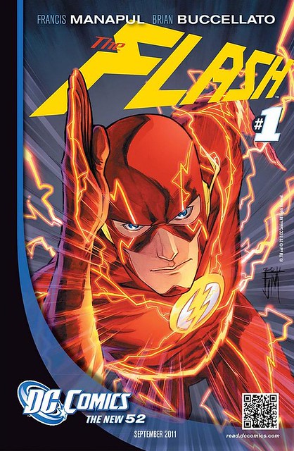
Flash 1 2011 promo

My DCBS order deadline came and went, and for the first time in a couple of years, I ordered nothing.  I debated for a while about whether I would jump on the new DC Universe bandwagon.  DCBS had some good discounts on all those #1 issues.  In the end, I couldn’t get excited about this latest iteration of the DC Universe.  I lived through so many events and changes already: the Silver Age, Bronze Age, Crisis on Infinite Earths, Millenium, Invasion!, Zero Hour, Final Night, etc.  What is coming now just seems like taking a Lego city set, smashing it on the floor and rebuilding it.  The end result will resemble something of what you had before, just slightly askew.

I could get behind the New DC a little more if they pulled a Julius Schwartz move and just reinvented the characters for a brand new age of comics.  The problem I have is DC’s insistence that all the important events of the past 20 years still happened in a compressed five-year period.  Tom Bondurant has a column on this topic: “Batman’s history calls for the biggest suspension of disbelief, because it reaches into the histories of both the Justice League and the Teen Titans. In the current timeline, where Damian Wayne is a product of Batman: Son of the Demon’s night of passion between Bruce Wayne and Talia al Ghul, one can argue credibly for a Bat-career of at least fifteen years, and probably more.”  Not just Batman, but Barbara Gordon’s journey from Batgirl to Oracle, Dick Grayson from Robin to Nightwing, etc.  Or something like the Green Lantern saga.  Hal Jordan became GL, served for a long time, then became Parallax and Kyle Rayner took over, then Rebirth happened?  This all happened in five years?  My suspension of disbelief is broken.  Of course, I have no problem believing a guy puts on underwear and goes out to fight crime.  But there you go, it’s my fan longevity that is the real problem.

There is another article that I appreciated, over on Speed Force by Greg Elias, titled Saying Goodbye to the Flash Story.  The long-term readers like myself, who followed DC since the Silver Age, appreciated an arc in the Flash family where the baton was passed from Barry Allen to Wally West.  The story of the kid sidekick who made the transition to lead superhero was exciting, and Wally was a better character in many respects because he was flawed.  Just as Kyle Rayner was when he took over as Green Lantern, or Connor Hawke when he became Green Arrow.  This second generation of heroes came together in Grant Morrison’s JLA series, one of the best expressions of the DC Universe concept.  For those of us who liked these changes, the past few years have seen a reversal.  Oliver Queen as Green Arrow was reborn, then Hal Jordan as Green Lantern, and finally, bland Barry Allen was brought back to replace Wally West.  Poor Wally—DC Comics won’t even mention his name at all in the latest go-round of promotions.  Gone is the hope that Wally would star in a Speed Force spinoff series; Kyle Rayner at least gets the spotlight in one of the GL books.  Some of us were even delusional enough to dream that Wally West might return as the Flash after Flashpoint ends, but that proved to be lunacy.  As Greg Elias pointed out, if you are mourning the generational saga of DC Comics, that is finally over.  Although in truth it ended a while ago, with the Rebirth series.

Over at Marvel Comics, I can’t find anything better there.  I can’t understand why Marvel spent the past few years bringing back Bucky, unfolding the Winter Soldier saga, and promoting Bucky as the new Captain America, only to kill him off once again.  I am sure he will return at some point.  But that is another symptom of a larger problem.  The superhero characters are worn out after 50 years of publishing.  Deaths and Reboots are the only thing that keep them alive.  They are electric shocks on a dying patient.  Sales are down—kill someone off!  I am down to one Marvel comic that I am getting, which is Avengers: Childrens Crusade.  Three more issues to go, then I am done with Marvel.

There are a few DC Comics that I can see buying in collected editions.  The Flash by Francis Manapul, despite all my bitching and moaning on the Flash saga, looks to be visually appealing.  I think Manapul stands a chance of becoming a good writer.  Action Comics, from Grant Morrison, might be an interesting twist on Superman’s origin, and Rags Morales artwork is very nice.  I can’t say the same for the regular Superman title.

For non-superhero comics, The Walking Dead and Scalped are superb and I get those in collections.  The latter was announced to be ending next year with issue #60.  But the best news from San Diego this year was Brian K. Vaughan’s return to comics with SAGA from Image.  That is something to look forward to.  But for the superhero material, I think I had better stick with my longboxes.  Nuff Said!

Tuesday, July 26, 2011

State of the Superhero Shrine, 2011

Superhero Shrine 2011

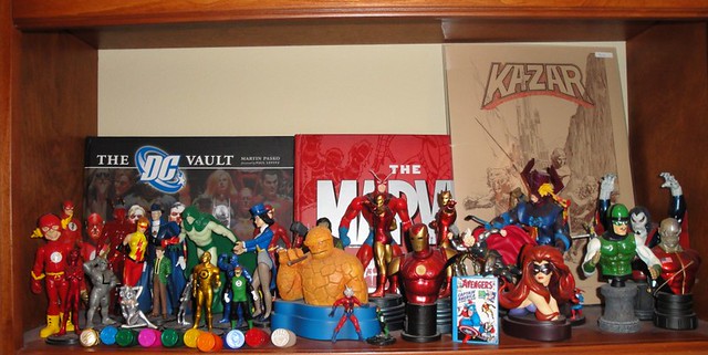
I stopped the addiction of collecting action figures and statues long ago, but I did hang onto what I had collected during the past 20 years.  Here’s my small shrine at home.  Some of my co-workers recently gifted me with a Hallmark Thor Keepsake Ornament and a Captain America Keepsake.  On the latter, Cap is busting out of Avengers #4.  The ornament opens up to an actual comic book, mini-sized, with the Jack Kirby artwork inside.  A great gift.  Nuff Said!

Friday, June 24, 2011

Gene Colan Commissions: Flash, Wonder Woman, Silver Surfer, Shazam vs Dracula, Howard the Duck

I have been hoarding these scans of various Gene Colan commissions—most of them were done in 2000 or 2001.  I’d like to share them now to celebrate his life and memory.

Gene Colan Captain Marvel vs Dracula Commission inked by Jerry Ordway

Shazam! Captain Marvel versus Dracula, the most unlikely battle of all, inked by Jerry Ordway.

Gene Colan Flash Commission

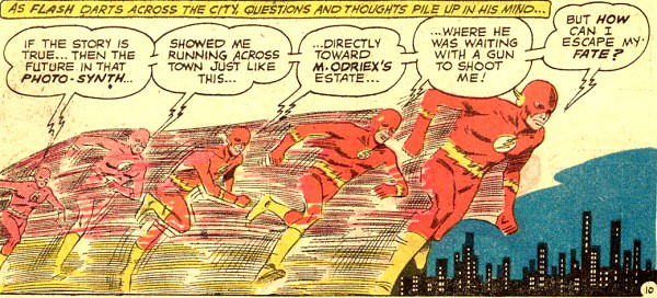
The Flash!  After seeing this piece, I think Gene Colan had a very unique method of drawing speed—not only does the character look great, but the background blurs and warps around him.

Gene Colan Wonder Woman Commission

Wonder Woman. 

Gene Colan Silver Surfer Commission

Silver Surfer.

Gene Colan X-Men Commission

X-Men.  I love how he put romantic touch here with Jean Grey and Scott Summers in the center of all the chaos.

Gene Colan Howard the Duck commission

Howard the Duck on a skateboard! 2001.

There you go, I thought all of these commissions by Gene Colan were remarkable.  Nuff Said!

Farewell, Gene Colan

Iron Man & Sub-Mariner 1 1967 cover by Gene Colan

Sad to hear of Gene Colan’s passing yesterday.  As many fans like myself are already well aware, Colan was one of the giants of the comic book industry.  To my taste, there are a number of artists which belong to an elite group for true originality in style and substance: Jack Kirby, Neal Adams, Jim Steranko, Gil Kane, John Romita, Berni Wrightson, etc.  Gene Colan was certainly in that list as well. 

Daredevil 87 1972 by Gene Colan, on the Golden Gate Bridge in San Francisco

Everyone who loved Colan’s artwork knows what I mean.  He approached comics like a film director, drawing a comic book panel as if he were looking through the lens of a movie camera.  Tilting the camera a bit for the best angle, sometimes tilting the entire panel (from a time when all panels were strictly rectangular) to get the best image.  Colan did tons of research as well, in a time there was no internet or Google, compiling photographic references.  Check out the panel above for Daredevil #87 in 1972, the first issue where DD moved to San Francisco.  Coit Tower, Lombard Street, the Bay Bridge, etc., all the famous landmarks appeared in Daredevil and gave the series a fresh look.

Doctor Strange 177

Three Marvel Comics series are forever locked with my memory of Gene Colan.  The first one was Daredevil, as I noted above.  Another was Doctor Strange, where he drew this iconic 1968 cover of Doc adopting his new “superhero” masked costume: Hail the Master!  When I wrote about my love for this cover on Giant-Size Marvel, a few people said I was totally nuts and this was the worst thing that ever happened to Doc.  But Gene Colan made this costume work in my mind—it was such a great cover that it was sold as a poster.  Even so, when Colan returned to Doctor Strange in the early 70s (sans mask), he did a superlative job as well.

Dracula Poster

Tomb of Dracula, of course, is the other series.  I still have the entire run of comics plus the Omnibus edition.  While Colan did a great job with superheroes, in some ways he was better suited to different genres like romance, mystery, and horror.  Marv Wolfman gave Colan all types of scenes to draw in the Dracula series. 

I mourn the passing of this great legend.  Farewell, Gene, you will be missed.  Nuff Said.

Monday, May 16, 2011

Carmine Infantino Penciller Publisher Provocateur: In His Own Words and Art

Carmine Infantino Penciller Publisher Provocateur 2010 book

Like many of you, I buy books and leave them piled up for the day I can eventually read them.  When TwoMorrows announced that Jim Amash and Eric Nolen-Weathington were working on Carmine Infantino: Penciler, Publisher, Provocateur, I pre-ordered immediately.  I even got the deluxe hardcover that came with a nifty Infantino sketch of The Flash.  The book arrived last Fall, but I just read it this weekend.  For any fan of comics history, this book is a goldmine.  It traces Infantino’s career from his early days working in the Golden Age of comics (for people like Joe Simon and Jack Kirby) to his transformative Silver Age run to his years as DC Comics publisher.  It is one long interview for over 160 pages, profusely illustrated with artwork, sketches, and photographs.

Panel of Super Speed by Carmine Infantion from Flash 116 1960

The Golden Age period from Infantino’s perspective is very interesting, especially his description of Jack Kirby producing pages at a level of quality that was unmatched by anyone.  I was always curious about how Infantino’s style evolved from the Golden to the Silver Age period.  Early in his career, artists like Milton Caniff obviously were a big influence and that was reflected in the Golden Age Flash stories.  Infantino had a strong desire to be a better artist and he studied for a few years in the early 50s at the Art Students League with Professor William McNulty.  This experience was a big influence on Infantino, teaching him about design, positive/negative space, and a love for Frank Lloyd Wright’s architecture.  There was a period of experimentation for Infantino where he adjusted his style, which irritated editor Julius Schwartz to no end.  Fortunately, by the time the Silver Age version of the Flash launched in Showcase #4, Infantino was more than ready.

Carmine Infantino Batman and Robin poster 1960s

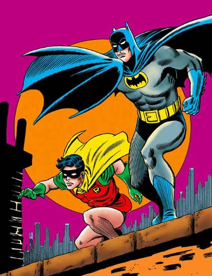
Man, this book really brings back a lot of great Silver Age memories.  One was this poster of Batman and Robin, probably the first superhero merchandise I ever bought.  I recall there was a glow in the dark version of this one?  I had it over my bed when I was enamored of the Adam West TV show.  Infantino was paid $30 for the illustration which was used by the Licensing Corporation of America on all kinds of products.  He was a bit miffed that no one compensated him further for any of the merchandising—which happened to almost all of Marvel and DC’s classic artists.

Mystery in Space 70 1961 Adam Strange cover by Carmine Infantino

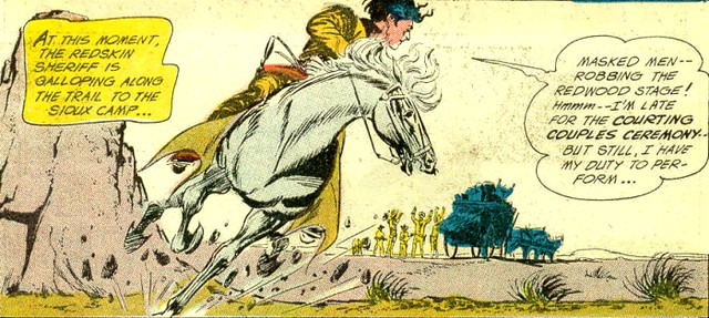
Carmine Infantino drew two of DC’s top characters with the Flash and Batman.  But I’ll always remember the offbeat characters that he drew: Adam Strange, Animal Man, Elongated Man, Super-Chief, Strange Sports Stories, etc.  I didn’t realize that Infantino created the visual for the first appearance of Black Canary.  And those crazy hands coming out of the captions—Infantino came up with that idea because he never read captions!  I became interested in a character I had never read before: Pow-Wow Smith, the Sioux Indian Sheriff from Western Comics.  Infantino created that character, too.

Pow Wow Smith from Western Comics 85 1961 by Infantino

How did Carmine Infantino go from being DC’s top artist to the editor in chief and publisher?  This book will tell you, in Infantino’s own words.  One thing I had never considered before: what if Infantino had not taken a corporate job and had remained an artist?  Would his style and storytelling have evolved into something even greater?  He asks that question himself and it is interesting to ponder.  I had always wondered what it must have been like for Infantino to transition from publisher back to working artist at places like Warren and Marvel Comics.  That is also covered in these interviews.  It wasn’t easy for him but he still produced some great work during this period.  You will also get Infantino’s thoughts on the death of the Flash (in the first Crisis), Sue Digby/Elongated Man in Identity Crisis,  and what he thinks of modern comics.  Can’t recommend this highly enough for all Infantino and DC Comics fans.  Nuff Said!

Link: Carmine Infantino: Penciler, Publisher, Provocateur

Monday, March 21, 2011

Introducing the NEW Wonder Woman

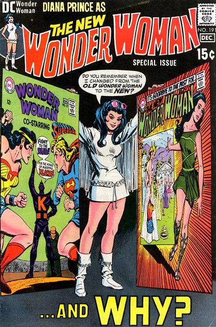
Wonder Woman 191 1970

Introducing the NEW Wonder Woman, circa 1968!  You didn’t think I actually meant Adrianne Palicki, did you?  The firestorm that erupted over ABC’s latest Wonder Woman and her Frederick’s of Hollywood costume somehow put my mind back to this incarnation of Diana Prince.  Imagine the internet firestorm that would have erupted in today’s marketplace if Mike Sekowsky and Denny O’Neill stripped the character of her super-powers, costume, and Justice League membership.  Diana Price became a Modesty Blaise type of character, traveling around the world with I-Ching and battling bad guys with martial arts instead of bracelets and magic lassos.  My very first Wonder Woman comic that I ever bought featured the “new” version, while I still read the costumed WW in Justice League of America Giant reprints.  The differences between the two didn’t bother me at all—I could tell that these tales were happening at two different eras.

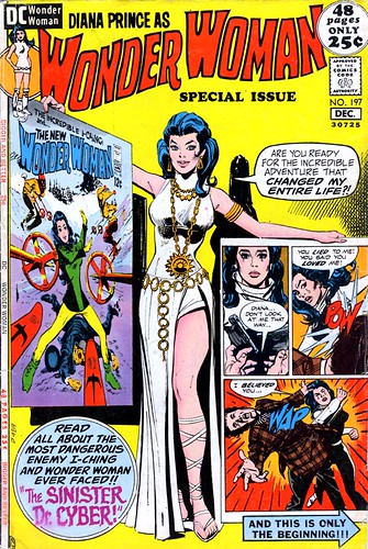
Wonder Woman 197 1971

There have been many articles written about the Diana Prince era, so I won’t recap the history here.  After perusing the comics for this article, they offered a lot more creativity and goofy fun than I remembered.  It makes me wonder if the new TV show should have considered using the look and some of the ideas here.  I think Wonder Woman, in the comics, works as a visual icon (great for merchandising), but fundamentally she is a flawed character.  WW was created by William Moulton Marston to bring a female superhero into comics—a good intention—but Marston was also expressing some mature sexual themes (bondage, S&M, etc) in the strip.  WW comes from an island inhabited by women where no men are allowed—but lesbianism is never discussed.  WW represents female liberation, but her costume has shrunk throughout the ages—today she dresses like a Maxim model.  She has super-powers and a Justice League membership, but doesn’t have a solid supporting cast and no life outside of being a super-hero.  Any attempt to bring Wonder Woman into TV or movies must do something to fix these problems for a modern audience.  The 1968 era Wonder Woman at least put her in different clothes and gave her a buddy to share adventures with.  There were nice romantic sub-plots as well, and it was great to see them jettison Steve Trevor.  I always hated Steve Trevor with a passion.  I couldn’t imagine why Wonder Woman would pine for that clown when she would have had more in common with Superman, Batman, or even Aquaman.

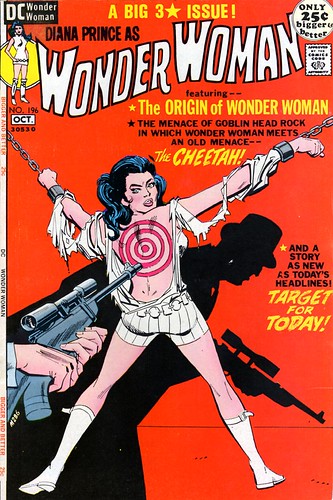
Wonder Woman 196 1971

However, even with the New Wonder Woman, the editors resorted to old tricks, by putting Diana in bondage scenes on the covers.  Issue 196 from 1971 stands out in my memory as a shocking cover for a kid to see: Diana’s shirt torn, a target painted on the back, while she is bound, utterly helpless in chains.  I remember buying this just to see what would happen next, so that cover worked, but it is interesting that Marston’s Id always finds a way to return to the character.

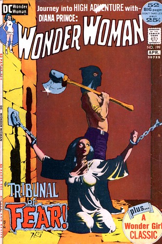
Wonde rWoman 199 cover by Jeff Jones

Three issues later, DC again put Diana in chains, but this time they had Jeffrey Jones, a contemporary of Berni Wrightson and Barry Smith, to do the cover.  I remember this particular issue fetching a slightly higher back issue price for a time, since Jones did few covers and he made this one look more like a gothic horror cover.

As controversial as the New Wonder Woman became in comics history, it was definitely interesting to me as a young reader.  I remember that I bought almost all these issues featuring Diana Prince, but oddly enough, when she went back to her old star spangled costume in 1973, I stopped buying the series completely.  The Diana Prince version seemed daring and different, in the same vein as Green Lantern / Green Arrow, the new Supergirl, the modern Lois Lane, and the new era of Batman.  When Diana returned to her old costume, it seemed like a giant step backward.  I’m crazy, I know, but when Diana went back, the creative team changed and the stories  just seemed old fashioned and dull.  It would take George Perez to get me interested in a superhero type Wonder Woman after Crisis on Infinite Earths.  Nuff Said!

Wednesday, January 26, 2011

Brian Bolland Leads the British Invasion in 1984!
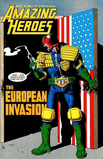
Amazing Heroes 52 1984 Judge Dredd British Invasion cover by Brian Bolland

DC Comics brought in a number of great creators from the United Kingdom, starting in 1984, and if you had read any imported comics like 2000 A.D. or Warrior magazine, you were eagerly anticipating their work on mainstream DC heroes.  If it was not obvious what was happening, this cover by Brian Bolland on Amazing Heroes #52 made it very clear.  Judge Dredd, the character who had cracked the American market with superb artwork by Bolland and others, had opened the door for other creators from the UK.

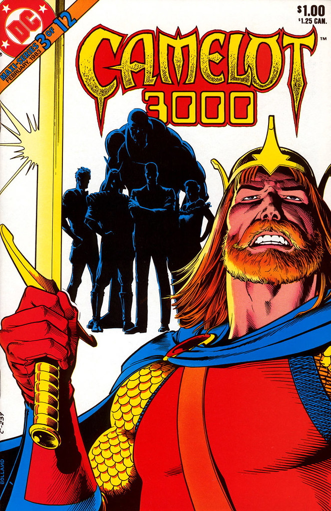
Camelot 3000 3 1983 cover by Brian Bolland

Bolland was almost finished with Camelot 3000 by the time that Amazing Heroes cover was published.  Eleven stellar issues had been published—though we would have to wait about a year for the final issue (#12) to finally appear in 1985.

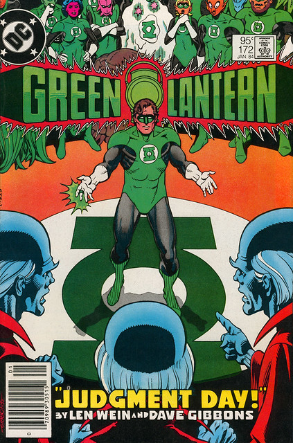
Green Lantern 172 cover by Dave Gibbons

Dave Gibbons became the regular artist on Green Lantern in 1984, joining writer Len Wein for a series of stories that would see John Stewart take over as Earth’s Green Lantern for a while.

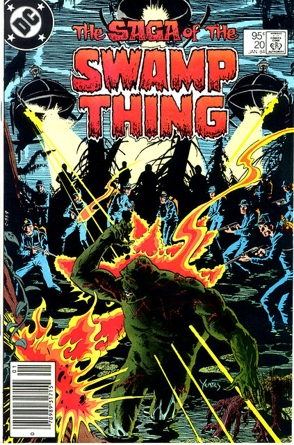
Saga of Swamp Thing 20 1984, Alan Moore's first issue

Alan Moore’s first issue of Swamp Thing was cover dated January 1984, meaning that it probably appeared in stores around Oct-Nov 1983.  I remember picking up this issue, without having read any of Moore’s previous work, but willing to give him a chance.  I thought it was a very good story and showed a lot of promise.  My jaw would drop to the ground when I read the next issue (#21) which contained The Anatomy Lesson.  That one prompted me to buy anything and everything written by Moore, including the Warrior magazines with the Marvelman & V for Vendetta stories.

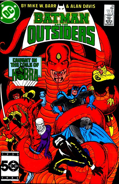
Batman and the Outsiders 26 1985 cover by Alan Davis

Alan Davis joined a bit later, in 1985, when his stint began on Batman & The Outsiders.  I enjoyed his work on this title, although when I re-read these issues now, his style was a bit rough and his storytelling was yet as “epic” as it would become in later years.

Later in 1988, we got a second wave of creators from the UK.  Jamie Delano started on Hellblazer #1, along with John Ridgway.  Neil Gaiman and Dave McKean’s Black Orchid mini-series was also published in 1988.  It was a revolutionary period for comics fans!  Nuff Said.

Ratings and Recommendations by outbrain