Paul Guinan on Facebook shared this wonderful illustration of Krypto meeting Bizarro!
Very cute. Notice the tail tucked between the legs. Nuff Said!
Thursday, July 20, 2017
Krypto and Bizarro Number 1 by Paul Guinan
Wednesday, July 19, 2017
Matt Reeves interview on The Planet of the Apes
I am sure everyone but myself has seen War for the Planet of the Apes this past weekend?
I did not, but looking forward to it. I still think the original 5 Apes movies are the best but these are good, and have some easter eggs for long term fans. I listened to KCRA's podcast The Business which has an interview with director Matt Reeves. The process involved in making these films is fascinating; they actually cut the movie together with all the dudes in their wetsuits (before the CG magic happens) and then send that off to Weta for the effects shots. On Dawn he had to make the movie within 2 years with a ticking clock; on War he had a full 3 years and reviewed every Apes film to figure out how to make this one. Reeves also discusses the forthcoming Batman film he is making starring Ben Affleck.
I was accidentally spoiled on the ending for War, not by Twitter, not by Facebook, but by the New York Times! The article is Andy Serkis on the Ending of 'War for the Planet of the Apes' and I did avoid it. However when flipping around to the end of the arts section, they had a question in bold type which my eyes could not avoid!
Terrible! All I can hope is that Ed Sheeran is not in a cameo in this film the way he was on Game of Thrones the other night! Nuff Said.
Monday, July 17, 2017
The Thirteenth Doctor Who: Jodie Whittaker!
The new Doctor Who was announced yesterday morning (California time) as the first ever woman to play the role: Jodie Whittaker!
I was more excited by this announcement than I might have thought! I don't have problems with Doctor Who being played by a woman, a black man, a gay person, or whoever. All I want is for Doctor Who to be interesting and vital. The reaction from fans was intense, including Francesco Francavilla above who did this nifty image of Whittaker as the Doctor from the teaser. For this fans who hate this change, I say: you don't have to watch. If you want a male Doctor there are hundreds of hours of past adventures you can view or listen to.
I have watched Doctor Who off and on since 1973. I watched the start of the Russell T Davies era and a handful of Tennant episodes. But I haven't become a hardcore fan until the Moffat era and Matt Smith arrived as the Tenth Doctor! He was so wonderfully comical, fun, and physical in the role. Smith was able to play an old man in a young man's body so perfectly. I loved his episodes so much I bought a Matt Smith blu ray collection with a special album format. This was my gateway drug. I suddenly got why Doctor Who is loved by fans all over the world. I even started watching classic Doctor Who to see what I missed. I got the Troughton connection to Matt Smith.
I was very excited to see Peter Capaldi take over the role in Season 8. I loved him in The Thick of It. His Doctor had a rough beginning in the first few episodes; unlike Matt Smith, he was not overly heroic and a bit too mean at the beginning. But Capaldi's Doctor evolved over time and by the time Pearl Mackie arrived, they were a delight this past season. I hate to see him go but I am very much looking forward to see Capaldi team up with the First Doctor in the Christmas Special this year.
It's way to early to tell how Jodie Whittaker will play the Thirteenth Doctor! But I think this is going to increase the popularity of Doctor Who. From the clips I have seen of her acting, she can be dramatic, funny, quirky, etc - combined with her relative youth (mid-thirties) this is going to be very appealing. While I loved Capaldi a lot - and what I really appreciated was that he was 180 degrees different than Matt Smith - I think a younger Doctor just naturally brings in more viewership. And with The Doctor being a woman it may bring new stories to the Tardis.
Onward and upward! Nuff Said!
Wednesday, July 12, 2017
New DC Comics Super Spectacular inspired blog logo by Scott Dutton!
You might notice a brand new logo on top of this page! Or perhaps you never visited before and think it's a cool nod to DC Comics Super Spectaculars. It's the work of Scott Dutton from Catspaw Dynamics who generously designed a new logo for me.
For comparison you can see my old logo here! Very crude, I put it together myself back in 2010 using some crude tools. I wrote a post about it here and how this blog originally started with the title Photon Torpedoes. I was always bothered by several things about my ham-fisted logo, first of all, for a blog where I do a lot of DC Comics stuff, it doesn't look like a DC Comic.
Scott Dutton previously revamped my header on Giant-Size Marvel and offered to do the same here. His new logo is dynamic and looks like the 1970s Super Spectaculars. The characters are from the 1970s and all resemble that era's Justice League. We've got a DC bullet and still at the low low price of 50 cents! And a number one issue.
To assemble this logo, Scott used the masthead from Superman Family 170, circa 1975! When giant-size DC comics were 50 cents and contained lots of content. Scott says "I added letters in the same style to finish the words. Geek was set in a suitably-fat typeface so it would stand out."
The Justice League figures come from this 1982 style guide page by José Luis García-López with inks by Dick Giordano. I think it's great how Black Canary (always my favorite) is waving hello to the viewer. Very nice. The days when J'onn J'onzz the Martian Manhunter was part of the team. Man, I miss that version of Green Arrow, too.
You can see Scott Dutton's specific coloring work on DC Comics here! Some great classic covers are there and creations of covers that were never published. Click on the images on his blog to see his process for each one. This particular recoloring of Wonder Woman 269 really made me pay attention to Scott's work. I love how he accentuated Wonder Woman in the foreground by changing the color scheme of the background players. That is a classic DC Comics vibe to me.
I've kind of let this blog go dormant over the past couple of years. I've always renewed the domain thinking I will get back to it. I gave up a while back, depressed at times over lack of traffic. My other blog, Giant-Size Marvel, gets a lot more eyeballs, I suspect because my keywords are better there and Marvel properties are so hot. I started this blog as Photon Torpedoes back in 2006 and I covered every geek topic under the sun. I complained every time someone revamped a comics character. I was doing images of comics cover art before Tumblr existed. I decided to split off all my Marvel stuff into Giant-Size Marvel and saw how having a narrow focus increases more interest. For this blog, I renamed it Giant-Size Geek in 2010, more DC centric but also reviewing some books and movies.
Why continue to blog at all? I decided it doesn't matter if I get traffic, I disabled all the crappy ads I used to have. I simply enjoy the act of writing once in a while and revisiting the comics that I love. I used to snark more. I have decided snarking or complaining is a waste of time and it's better to focus on things you feel mostly positive about. I won't update the blog every day, but perhaps 1-2 times per week from now on. Until I get lazy again.
Nuff Said!
For comparison you can see my old logo here! Very crude, I put it together myself back in 2010 using some crude tools. I wrote a post about it here and how this blog originally started with the title Photon Torpedoes. I was always bothered by several things about my ham-fisted logo, first of all, for a blog where I do a lot of DC Comics stuff, it doesn't look like a DC Comic.
Scott Dutton previously revamped my header on Giant-Size Marvel and offered to do the same here. His new logo is dynamic and looks like the 1970s Super Spectaculars. The characters are from the 1970s and all resemble that era's Justice League. We've got a DC bullet and still at the low low price of 50 cents! And a number one issue.
To assemble this logo, Scott used the masthead from Superman Family 170, circa 1975! When giant-size DC comics were 50 cents and contained lots of content. Scott says "I added letters in the same style to finish the words. Geek was set in a suitably-fat typeface so it would stand out."
The Justice League figures come from this 1982 style guide page by José Luis García-López with inks by Dick Giordano. I think it's great how Black Canary (always my favorite) is waving hello to the viewer. Very nice. The days when J'onn J'onzz the Martian Manhunter was part of the team. Man, I miss that version of Green Arrow, too.
You can see Scott Dutton's specific coloring work on DC Comics here! Some great classic covers are there and creations of covers that were never published. Click on the images on his blog to see his process for each one. This particular recoloring of Wonder Woman 269 really made me pay attention to Scott's work. I love how he accentuated Wonder Woman in the foreground by changing the color scheme of the background players. That is a classic DC Comics vibe to me.
(Not Scott's work but my clumsy attempt!)
I've kind of let this blog go dormant over the past couple of years. I've always renewed the domain thinking I will get back to it. I gave up a while back, depressed at times over lack of traffic. My other blog, Giant-Size Marvel, gets a lot more eyeballs, I suspect because my keywords are better there and Marvel properties are so hot. I started this blog as Photon Torpedoes back in 2006 and I covered every geek topic under the sun. I complained every time someone revamped a comics character. I was doing images of comics cover art before Tumblr existed. I decided to split off all my Marvel stuff into Giant-Size Marvel and saw how having a narrow focus increases more interest. For this blog, I renamed it Giant-Size Geek in 2010, more DC centric but also reviewing some books and movies.
Why continue to blog at all? I decided it doesn't matter if I get traffic, I disabled all the crappy ads I used to have. I simply enjoy the act of writing once in a while and revisiting the comics that I love. I used to snark more. I have decided snarking or complaining is a waste of time and it's better to focus on things you feel mostly positive about. I won't update the blog every day, but perhaps 1-2 times per week from now on. Until I get lazy again.
Nuff Said!
Tuesday, July 11, 2017
Howard Chaykin interview on The Virtual Memories podcast
Howard Chaykin is stirring up a lot of controversy with this recent Image series, The Divided States of America.
He's been a fascinating creator that I've followed since the 1970s. The image above is from an adaption of The Stars My Destination, a Byron Preiss project that he did in the period before American Flagg. Chaykin is also an interesting figure to me because one of his mentors / friends was Gil Kane. The Virtual Memories Podcast has an epic (nearly 2 hour) long interview with Chaykin about his entire career and life. If you are a fan you will want to listen to this, it covers his early career to American Flagg, his period away from the industry (working in television), his life in California and sobriety of over 25 years.
Nuff Said.
Sunday, July 9, 2017
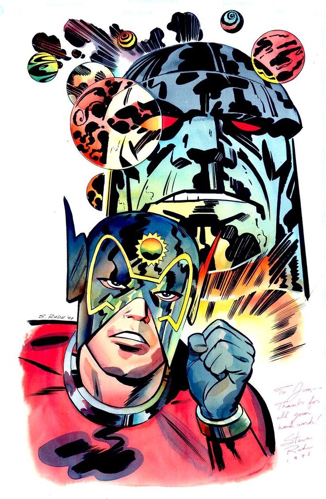
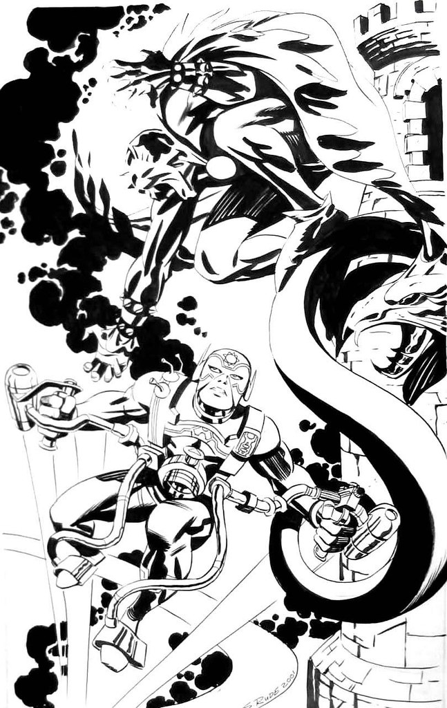
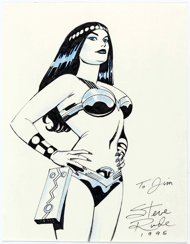
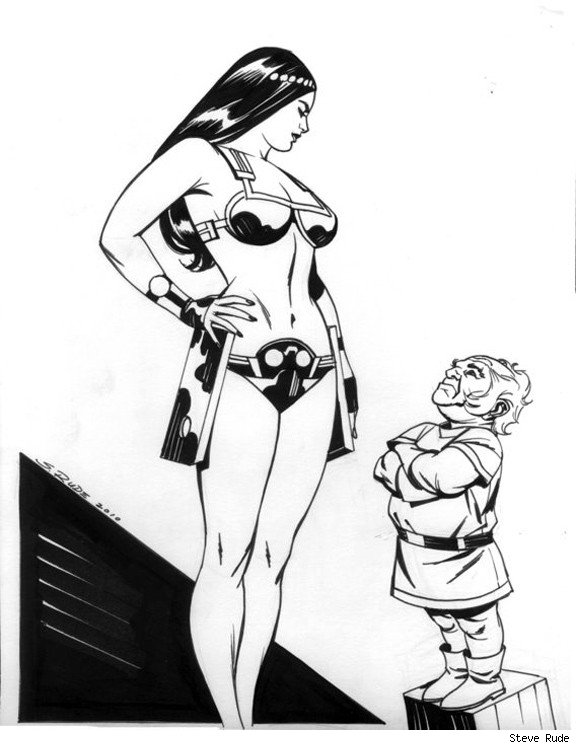
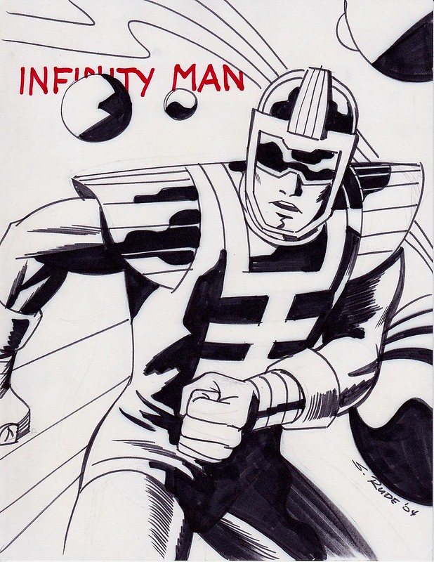
Steve Rude on Jack Kirby's Metron, Orion, Big Barda!
I recently joined the Steve Rude fans page on Facebook where I found a number of New Gods related commissions...
Darkseid and Orion, father and son.
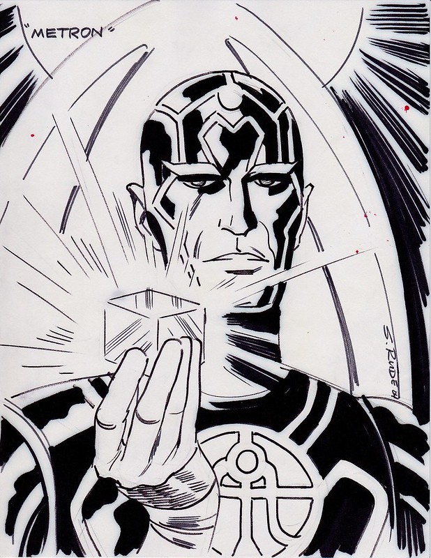
Metron! Holdinga little Mother Box the X-Element (see this image and comment below) in his hand, very nice.
Orion versus The Demon!
Big Barda.
Big Barda and Oberon!
Infinity Man.
Lashina, lashing out!
Nuff Said!
Darkseid and Orion, father and son.
Metron! Holding
Orion versus The Demon!
Big Barda.
Big Barda and Oberon!
Infinity Man.
Lashina, lashing out!
Nuff Said!
Labels:
Big Barda,
Demon,
Jack Kirby,
New Gods,
Steve Rude
Saturday, July 8, 2017
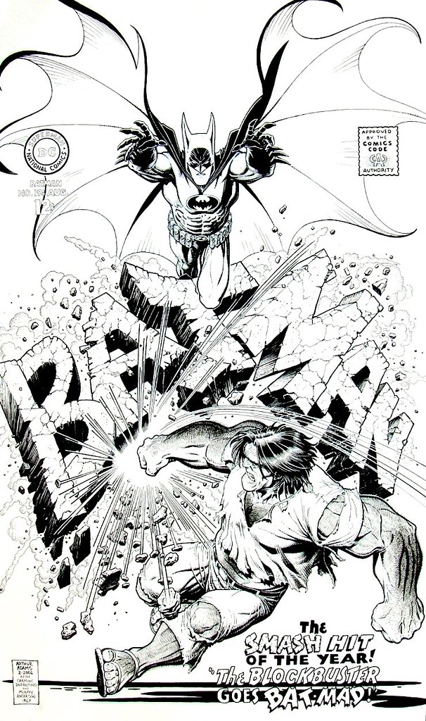
Batman 194 logo shattering cover recreation by Art Adams
Here's a nifty cover recreation by Art Adams: Batman fighting Blockbuster, who shatters his logo to pieces...
Art Adams is a true gentleman who credited the original cover to Carmine Infantino...
Infantino was a brilliant artist / editor / cover designer. This was done during a time when you didn't see many logos getting destroyed on covers. Was it the first? I am not sure but it was one of the early memorable ones. Nuff Said!
Tuesday, July 4, 2017
Batman taking out Swamp Thing by Frank Cho
A one minute later commission by Frank Cho...
...a take off from the cover of Swamp Thing 6. Nuff Said!
...a take off from the cover of Swamp Thing 6. Nuff Said!
Saturday, July 1, 2017
Digital Comics: Comixology Guided View vs Kindle Guided View
This may be the most nerdy, nit-picky, tech/comics related post in the world. If you're a comics purist who only reads actual physical comics, or comics from the past, I'll just save you some time, this article probably isn't for you.
I have been reading a lot of digital comics lately, for many reasons familiar to many of you. Space is limited for longboxes of comics, so is the cost, etc, and my wife is worried that I am could become a hoarder. So I thought, better stop now while are hallways are clutter free. Since the first of the year I have bought a bunch of digital comics on sale. Comixology, like Amazon's Kindle Daily Deals, always has some weekly promotion guaranteed to make you want to buy more comics. And then there was this crazy glitch of 95% off certain Marvel titles at the beginning of June 2017. Now I have way too much to read or re-read.
At first I was a bit of a purist, reading the complete page as it is physically presented, on my iPad Pro. I thought Guided View was terrible when I first heard about it. It reminded me of early 1990's AOL Comics with Spider-Man.
However, after reading a comic written by Brian Bendis, The Infamous Iron Man (Doctor Doom as a hero, pretty good yarn), I changed my mind. I decided for certain types of comics, guided view is quite nice! Especially for a Bendis comic, it really helps to navigate through this thorny vein of word balloons. I don't usually get lost reading a comic, but in a Bendis written tale, sometimes I do, especially on a two page spread of panels. Beyond the comics that are word heavy, it is just kind of nice to have the page zoomed in a bit on the panel you are reading, especially for old eyes. In this comic, Guided View became an almost movie like experience. It zoomed in on the person or group who was talking, and it felt like the camera was moving in point of view shots. I was mesmerized. I think if there is a case for Guided View it might be with the type of comic that Bendis often writes. It may not work as well with a comic done by Frank Cho? I am just guessing, not sure at all.
Since I got the Jason Aaron written Thor volumes at a good price, I have been re-reading those and using Comixology Guided View. You can see an example of the zoomed in page from Thor volume 1 by Russell Dauterman. It's zoomed in on the panel where old Thor fights new Thor. There is a black part above it because this is the top panel on the page - there is nothing above, it has been moved into the center of the screen. You still see the panel below it - and when you swipe right to left, that is the panel that will be zoomed next. I like this because it is like reading a real comic, in a way. You see all of the panels but your eyes focus on one section at a time.
Comixology is a wonderful app. But after you have bought dozens of comics / collections, it has a slight drawback. It's hard to find your stuff! Comixology has "Smart Lists" that show you Recently Purchased, Recent Downloaded, and so on. You can expand Recently Purchased and see your hundreds of titles there. There is no Search feature for just titles that you own; search is performed on all titles that Comixology has for sale. That seems like a real drawback to me! I don't know how people who have been buying comics on this service have coped with it.
If you've merged your Comixology and Amazon accounts, then you have the ability to read comics either in the Comixology or Kindle apps. The Kindle app does have a nicer user interface (IMHO) for navigating your stuff and a better Search feature. So I began to think, perhaps I should switch over to reading comics on the Kindle app on iPad.
I found my comic very quickly on the Kindle and downloaded it, started reading and using Guided View. You would think, reading this page from Comixology, that Guided View would be the same on both apps. It's not. This is the same page from Thor in the Kindle iOS app. It's zoomed in on the same scene, but the panel border is blacked out below. This is to isolate the panel even more? I noticed the difference right away. It is not appealing at all to me, because it cuts out way too much of the page. A comic book panel isn't made of up of squares - you can see in this case, the panel is at an angle. By squaring off a portion of it, they destroyed the flow of the page.
I began comparing other pages to see if they bothered me as much. Here's a panel for Thor issue 5, illustrated by Jorge Molina. Using Comixlogy Guided View I am specifically looking at the panel where Thor points Mjolnir towards the villains - it almost seems like the hammer is pointed at us, the reader, almost three dimensional, since it pops out of the panel borders. This is part of the magic of comics. Comics have a structure and a language, and breaking those conventions make wonderful little moments.
Here's the same panel in Kindle Guided View. Completely destroys the effect of reading this page by cutting off the panel into a rectangle. For some reason they decided the top and bottom rectangles surrounding this should be light blue. No idea why that decision was made. Because there was some light blue in the original page?
Then I thought - Thor 5 is on Marvel Unlimited, which I still have for a couple of months. Let's see how Marvel Unlimited Guided View represents this panel. A little better - you see more of the hammer but it still gets cut off on the bottom. At least they went with black on the top and bottom. It's a little better but not much.
I am kind of shocked that Guided View is not exactly the same on both Comixology and Kindle, though I shouldn't be. Companies share the same engine and tweak settings for their individual needs. I've decided after this little analysis that I am going to stick with the Comixology app for reading comics! Nuff Said.
Subscribe to:
Comments (Atom)


