You may have noticed that our blog name has changed. What used to be Photon Torpedoes (since 2006) is now called Giant-Size Geek! Or, you may not have noticed! :-) We changed the name for a few reasons:
- Spelling Photon Torpedoes in a browser, twitter, or email, was a pain.
- Does the word Torpedoes contain 1 or 2 of the letter “e”? I felt like Dan Quayle every time I typed it.
- What is a blog called Photon Torpedoes about, other than Star Trek or science fiction?
I had this idea, since my other blog, Giant-Size Marvel, is fairly popular, why not create another Giant-Size blog? Photon was really about everything Geeky that I liked and my co-writers liked. Giant-Size Geek was perfect, the domain name was available, so were the Twitter, Gmail, and Facebook accounts.
Now I had to create a new masthead on top. It isn’t perfect by any means, it really is geeky. But here is how I did it…
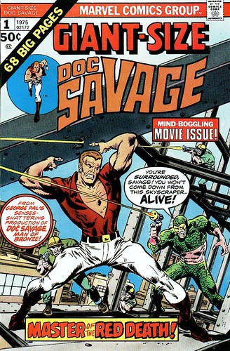
I wanted to have the same Giant-Size logo style as the Marvel blog, but with a different color scheme to distinguish it better. Giant-Size Doc Savage had a red logo on a light blue background, which I though was pretty good.
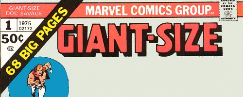
I wiped out the rest of the Doc Savage logo and smoothed out the blank area below the logo. Later, I would wipe out the “Marvel Comics Group” on the header and the words Doc Savage on the upper left. That blue circle surrounding Doc had to go, too. I moved Doc over to the left a bit. I needed more room for the word GEEK and the superhero characters I wanted to populate that area.
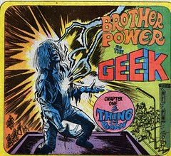
My biggest problem was where to find a Geek logo? The most famous Geek in comics history is DC Comics Brother Power The Geek, who had a 2 issue run in 1968. I didn’t quite like the logo from the covers, but the inside splash page of issue #1 had a logo that I liked. I took this and changed the colors to make it make the Giant-Size scheme.
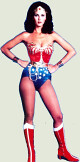
I took a variety of characters that I’ve liked ever since I was a kid, and tried all kinds of arrangements plugging them in. They had to be DC Comics, Science Fiction, or Pulp related characters. I didn’t want Marvel as that is on my other blog. I did toy with using Deathlok from an Astonishing Tales masthead. I also toyed with using Ron Ely as Doc Savage (from the 1970s movie poster) and Lynda Carter as Wonder Woman. Real life characters look a bit strange next to silver age drawings, so I nixed that idea.
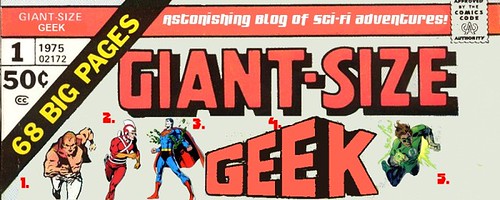
The final masthead had four characters representing both DC Comics, superheroes, science fiction, and pulp adventure:
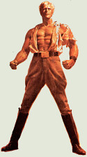
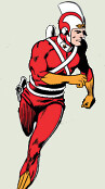
- Doc Savage, drawn by Ross Andru, from the Marvel Doc Savage series.
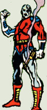
- Adam Strange, drawn by Carmine Infantino and Murphy Anderson.
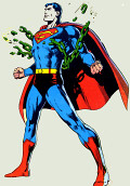
- Superman, by Neal Adams, from the famous Superman #233 “Kryptonite Nevermore” issue.
- Geek logo from Brother Power the Geek #1, 1968.
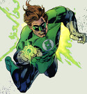
- Green Lantern by Gil Kane and Kevin Nowlan from the 1996 GL Gallery.
You will probably see this character lineup change over time. I already have some ideas for Halloween.
Nuff Said!
No comments:
Post a Comment